
The Six Positions in One Map
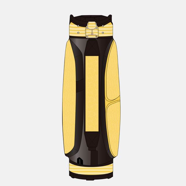
Ball pocket (primary), apparel pocket (secondary), spine, strap, top cuff, and accessories. Every photograph of a golf bag — on course, on TV, on social media — shows the ball pocket side; that single fact organizes the whole placement strategy.
Widths are the logo's horizontal measure on the usable panel — the flat area inside seams, piping and curvature. The customization options hub covers the techniques each position accepts; this guide is about the geometry and the strategy.
| Position | Stand bag | Cart bag | Staff bag | Role |
|---|---|---|---|---|
| Ball pocket panel | 180–250 mm | 200–280 mm | 250–350 mm | Primary — the photographed face |
| Apparel pocket side | 120–180 mm | 150–200 mm | 200–280 mm | Secondary mark |
| Spine / back panel | 80–120 mm | 100–140 mm | 120–180 mm | Tertiary — caddie-side visibility |
| Shoulder strap | 60–90 mm | — | 80–110 mm | Carried-context mark |
| Top cuff ring | 60–100 mm | 80–120 mm | 100–150 mm | Detail-tier, close range |
| Accessories (towel ring, patch) | 40–80 mm | 40–80 mm | 40–80 mm | Finishing touches |
The Visibility Hierarchy: Why the Ball Pocket Wins
A golf bag at rest stands on its base with the ball pocket facing the viewer — on the first tee, beside the green, in every range photograph, in every televised shot of a tour bag. The ball pocket panel is also the largest uninterrupted flat surface on any chassis. Those two facts — most-seen and biggest — make it the primary position on every serious branding architecture, and the position to get right before any other is discussed.
The apparel pocket side ranks second because it is the alternate view: when a bag is carried, the ball pocket faces the player's body and the apparel side faces the world. On televised golf, caddies set bags down alternating sides — broadcast exposure splits roughly 60/40 between the two faces. The spine matters in one specific context: bags lined up on a range or in a bag room, where only the spine shows. Strap and cuff are close-range positions — seen by the player and the foursome, not the camera — which is why they carry detail-tier marks rather than primary branding investment.
Size Math: the 55–70% Rule
Logos on bags are sized relative to their panel, not in absolute millimeters, because panels vary by chassis. The working rule: horizontal width at 55–70% of usable panel width, height following the artwork's natural proportions, with at least 20 mm clearance from every seam, zipper curve and piping line. Below 55% the mark reads timid at photography distance; above 70% it crowds the panel and warps visually at the panel's curved edges.
Worked example: a stand bag ball pocket with 320 mm usable width takes a crest at 180–225 mm — we default to 200 mm unless brand guidelines dictate otherwise. The same crest on a staff bag's 480 mm panel runs 260–335 mm. This is why "make the logo bigger" is a meaningless instruction until the chassis is chosen: the chassis pages list usable panel dimensions per model, and the quotation stage fixes exact millimeters for your artwork.
Technique Decisions per Position
Ball pocket: embroidery for crests and wordmarks (the texture reads as quality at macro range), screen print for large multi-color graphics, or the retail-standard combination — embroidered crest centered, printed graphic beneath. Apparel side: print usually wins — the panel is large, slightly curved, and secondary; full embroidery there adds cost and stiffness for a position cameras see 40% of the time. Spine: embroidery or woven label — narrow vertical formats only. Strap: embroidery or woven tape running the strap length. Top cuff: embroidery on the ring or a debossed patch. Accessories: woven labels, rubber patches, engraved hardware.
The stitch-count ceiling matters: embroidery above roughly 25,000 stitches on a flexible panel risks puckering the fabric around the design. Artwork exceeding that — big filled shapes, dense gradients — belongs to print. The embroidery page and screen printing page detail the technical constraints; the techniques comparison walks the cost and durability trade-offs across all four methods.
Position Strategy by Program Type
Retail private label runs the full architecture: primary ball-pocket crest, secondary apparel print, spine wordmark, strap tape, woven labels throughout — the bag must carry the brand at shelf distance, macro range and in-use. Corporate and tournament programs simplify to two positions: ball pocket plus one, because the recipient's foursome is the audience and two well-executed positions outperform five mediocre ones. Team and academy programs add the roster dimension: ball pocket for the team crest, apparel side for the individual name (heat transfer, added post-production from your spreadsheet), strap for the number. Promotional mass giveaways concentrate everything on one hero position executed properly rather than diluted coverage.
The private label brands page and teams page show these architectures in program context — placement strategy is always downstream of who will see the bag and where.
Color Strategy on Panels
Placement and color interact in ways buyers discover too late if nobody warns them. Tone-on-tone embroidery (navy thread on navy panel) is the premium retail look — but it disappears at photography distance, so it suits detail positions, not the primary panel. High-contrast execution (white crest on navy, gold on black) photographs best and suits the ball pocket. Metallic threads read beautifully at close range and reflect unpredictably under stadium and studio light — test at sample stage, which is what samples are for.
Multi-color crests should be proofed against the actual panel color, not on white paper: a crest designed on white often loses its lightest elements on a cream panel or its darkest on navy. The lab-dip and strike-off loop exists for exactly this — your artwork is test-sewn on your actual fabric before the sample is built. The color matching page covers the thread and fabric matching protocol under D65 light.
The Two-Touch Discipline vs Full Coverage
Two philosophies, both legitimate when chosen deliberately. Full coverage — five or six branded positions — is the retail private label standard: the bag is the product, the brand is the reason to buy, and every panel earning its mark raises perceived value. Two-touch — primary position plus one — is the gifting and promotional standard: the bag is the messenger, and restraint reads as confidence. The failure mode is the undecided middle: three or four positions branded inconsistently (different colors, different logo versions, different scales), which reads as neither premium nor confident but merely noisy.
Consistency rules whichever philosophy you choose: one logo version across all positions, one colorway decision applied everywhere, and proportional scaling (the apparel-side mark at 60–70% of the ball-pocket size, the spine at 40–50%). A bag where every mark relates mathematically to the primary reads as designed; a bag where each position was decided separately reads as assembled.
Placement Mistakes That Reach Production
- Ignoring the curve. Panels curve at their edges; a logo placed to the panel's full width warps visibly at the extremes. The 20 mm seam clearance exists for this.
- Sizing from the artwork file. "The logo is 300 pixels" is not a dimension. Millimeters on the named panel, agreed at sample stage, is the only spec that survives to production.
- Splitting a crest across a zipper. The ball pocket zipper bisects some panels; artwork placed over it distorts at every open-close. Above or below — never across.
- Embroidery beyond the stitch ceiling. Dense filled artwork puckers flexible panels; over 25,000 stitches, the design belongs to print.
- Forgetting the carried view. Branding only the ball pocket means your logo faces the player's body half the time. The apparel-side secondary mark exists for the carried context.
- Panel-blind reordering. A crest sized for a stand bag's 320 mm panel placed on a staff bag's 480 mm panel reads lost. Re-spec dimensions when the chassis changes.
How Placement Gets Engineered: the Template System
Placement in production is not eyeballed — it is templated. Each chassis has a placement template (a physical acrylic guide and its digital twin) fixing every branding position in millimeters from fixed reference points: seam intersections, zipper ends, the top cuff edge. Your approved sample photographs the artwork against those reference points; bulk production places every piece against the same template; IPQC checks placement against it at line side. This is how bag 1 and bag 500 carry the crest at the same millimeter — and why the sample approval matters so much: you are approving the template, not just the bag.
For OEM chassis development, the template is created during pattern engineering and locked with the pattern itself — one more reason placement decisions belong at the brief stage, not after sampling. The quality page documents the IPQC placement checks that run against these templates during bulk.
Vertical and Horizontal Layouts on Tall Panels
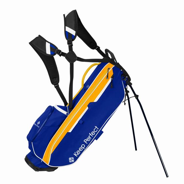
Staff bag ball pockets and stand bag apparel panels are tall rectangles, and artwork orientation on them is a design decision with rules. Horizontal wordmarks sit at the panel's visual center — the upper third — where a standing bag presents them at eye level; stacked crests (icon over wordmark) center on the panel's geometric middle; vertical wordmarks running down the panel read as deliberate and European, but they demand letterforms that survive rotation. What never works is horizontal artwork stretched to fit a tall panel's width — the 55–70% rule applies to the artwork's natural proportions, not to the panel's.
Test orientation at the placement-sheet stage with the artwork rendered to scale on the actual panel outline. The two-minute exercise kills more bad decisions than any other step in branding development: a crest that sings on a landscape spec sheet can read lost on a portrait panel, and discovering that on a rendered sheet costs nothing while discovering it on 300 bags costs everything.
Specialty Chassis: Sunday, Junior and Travel
Non-standard chassis rewrite the map in predictable ways. Sunday bags have a reduced panel architecture — one main pocket panel that absorbs primary and secondary duties — so branding concentrates: one hero mark, executed at the larger end of the size rule, because there is no second face to carry the story. Junior bags scale everything down proportionally (the 55–70% rule holds; the millimeters shrink), and their audience makes the apparel-side position unusually valuable — junior bags live on small shoulders, carried-view dominant. Travel covers brand best at the hood and the base panel — the two surfaces visible on an airport carousel, which is the entire audience that matters.
The principle underneath: placement follows the context in which the product is actually seen, not the product's geometry alone. Ask of any chassis the question that organizes everything — when this product is doing its job, who is looking at it, and from where? The travel covers page and junior page map those contexts per chassis.
Getting Your Placement Specified
The practical path: send your vector artwork and target chassis through the quote form, and the quotation comes back with a placement sheet — your logo rendered to scale on your chassis's panels, dimensions in millimeters, technique per position. That sheet is what the sample confirms and the template locks. It costs nothing, takes a day, and converts "where should the logo go" from an argument into a document.
Frequently Asked Questions
Where does the logo go on a golf bag?
Six standard positions: the ball pocket panel (primary — the most photographed face in golf), the apparel pocket side (secondary — the face visible when carried), the spine, the shoulder strap, the top cuff ring, and accessories like woven labels and patches. Every branding architecture starts with the ball pocket and builds outward by audience and budget.
What size should a logo be on a golf bag?
55–70% of the usable panel width, with at least 20 mm clearance from seams and zippers: typically 180–250 mm on stand and cart bag ball pockets, 250–350 mm on staff bags. The apparel-side secondary mark runs 60–70% of the primary size, the spine mark 40–50%. Exact millimeters are fixed on the placement sheet at quotation stage.
What is the most visible position on a golf bag?
The ball pocket panel — the largest flat surface on any chassis and the face a standing bag presents to viewers on tees, greens, ranges and in every photograph. The apparel pocket side ranks second because it faces outward when the bag is carried. Broadcast exposure splits roughly 60/40 between the two faces.
Embroidery or print for golf bag logos?
Embroidery for crests and wordmarks on the primary panel — texture reads as quality at close range and survives years of use. Print for large multi-color graphics, gradients, and anything above roughly 25,000 stitches where embroidery would pucker the panel. The retail standard combines both: embroidered crest, printed side graphic.
How many logo positions should a branded golf bag have?
Retail private label runs full coverage (five to six positions) because the bag is the product; corporate and promotional programs run two touches (primary plus one) because restraint reads as confidence. The failure mode is the undecided middle — three or four positions branded inconsistently, which reads as noise.
Can each bag carry a different name or number?
Yes — individual names and numbers are added by heat transfer post-production from your spreadsheet, typically on the apparel pocket or ball pocket beneath the main crest. This is the standard architecture for team and academy programs: crest embroidered for all, names transferred individually. Budget USD 1.50–3.00 per name and proof the roster file carefully.
What file do you need for logo placement?
Vector artwork (AI, EPS or PDF, fonts outlined) with Pantone references. From that we produce a placement sheet — your logo rendered to scale on your chassis's panels with millimeter dimensions and technique per position — which the sample then confirms. JPEGs must be redrawn to vector first (USD 20–50 studio service).
How is placement kept consistent across hundreds of bags?
By template: each chassis has a physical placement template fixing every branding position in millimeters from seam and zipper reference points. Bulk production places every piece against it, and IPQC checks placement at line side against the same guide. Your sample approval locks the template — which is why bag 1 and bag 500 carry identical crests.
Do metallic threads work on golf bags?
Yes, with one caution: metallic thread reads beautifully at close range but reflects unpredictably under stadium and studio lighting, and it is more abrasion-sensitive than rayon or polyester. It suits detail positions and premium retail crests; test it at sample stage under the lighting your product will actually face.
Can the logo go across the ball pocket zipper?
Never across — a zipper bisecting artwork distorts it at every open-close cycle. Crests sit above or below the zipper line; the placement template for each chassis marks the zipper-safe zones. If your artwork is very tall, the fix is scaling or repositioning, not bridging.
What is tone-on-tone branding and when should it be used?
Thread matched to the panel color (navy on navy) — the premium retail look, subtle and texture-driven. It suits detail positions and high-end retail programs; it fails at photography distance, so never use it for the primary panel unless the program explicitly prioritizes in-hand subtlety over camera visibility.
Should the logo face outward when the bag is on a golf cart?
Cart bags are engineered with exactly that orientation: their primary branding panel faces away from the cart body, visible to following groups and on the path. When briefing a cart chassis, confirm the panel layout is cart-oriented — a stand bag panel map transposed onto a cart chassis can put the hero mark against the cart frame. The chassis library handles this natively, but OEM projects should state the carried context explicitly.
Can we use two different logos on one bag?
Yes — the common pattern is a primary crest on the ball pocket and a wordmark on the apparel side or spine. Keep them in one colorway decision and proportional scale, and the pair reads as a system. What fails is two unrelated marks competing at similar sizes on adjacent panels: the eye needs a hierarchy, and the placement sheet should state which mark leads.
Does logo placement affect the price?
Position count and technique drive decoration cost, not position identity: a second embroidered position adds roughly USD 0.60–1.20 per bag depending on stitch count, print positions add USD 0.40–0.90. The placement sheet prices every position explicitly, so architecture decisions happen with the cost visible — the two-touch discipline is usually a design choice first and a budget choice second.
How close to a seam or zipper can branding safely go?
The working minimum is 20 mm clearance from every seam, zipper curve and piping line. Closer than that, two problems appear: the decoration distorts where the panel curves into the seam, and the stitching or print stress-cracks at the flex point with use. The placement template for each chassis marks these safe zones explicitly — the 20 mm rule is why the 55-70% sizing rule exists.
How do I get a placement specification for my logo?
Send vector artwork and your target chassis through the quote form on this site; the quotation returns with a placement sheet — logo rendered to scale on each panel, dimensions in millimeters, technique per position. The physical sample then confirms it before bulk. The sheet is free and takes a day.